SPORTQUAKE
BRAND REPOSITION
SportQuake needed to evolve its brand to better position what it offers and sharpen its overall approach. The goal was to build a stronger presence in a competitive market by increasing visibility and relevance, helping attract new audiences while still staying true to what existing users already value.
This repositioning also aimed to bring the brand more in line with modern sponsorship trends, helping it connect more effectively with partners and clearly communicate its value in an evolving sports and commercial landscape.
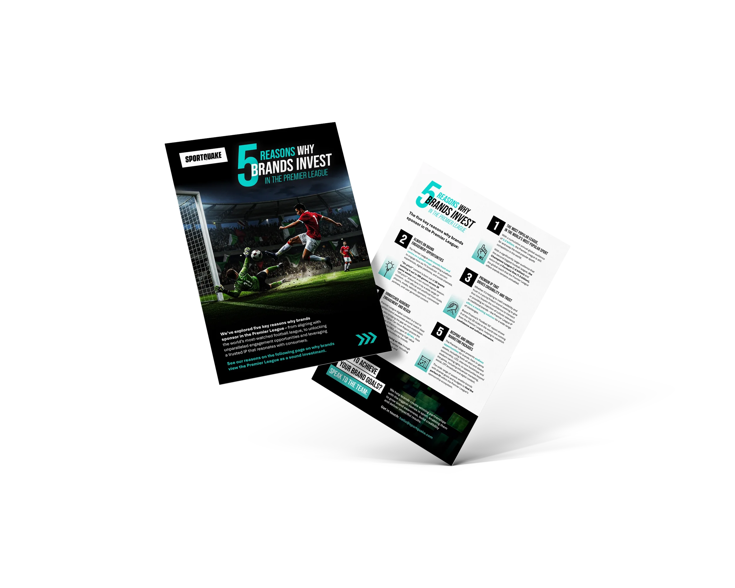
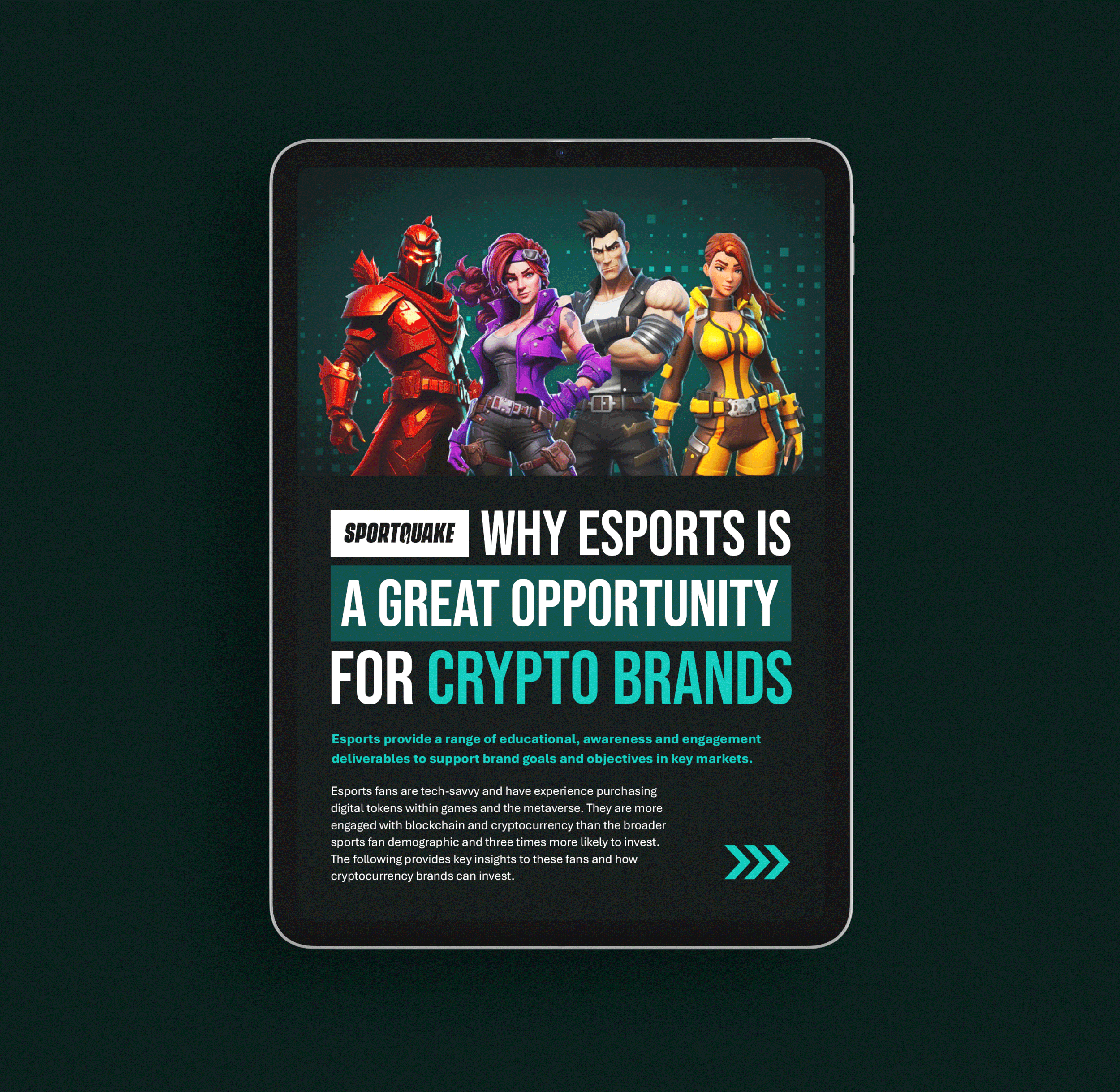
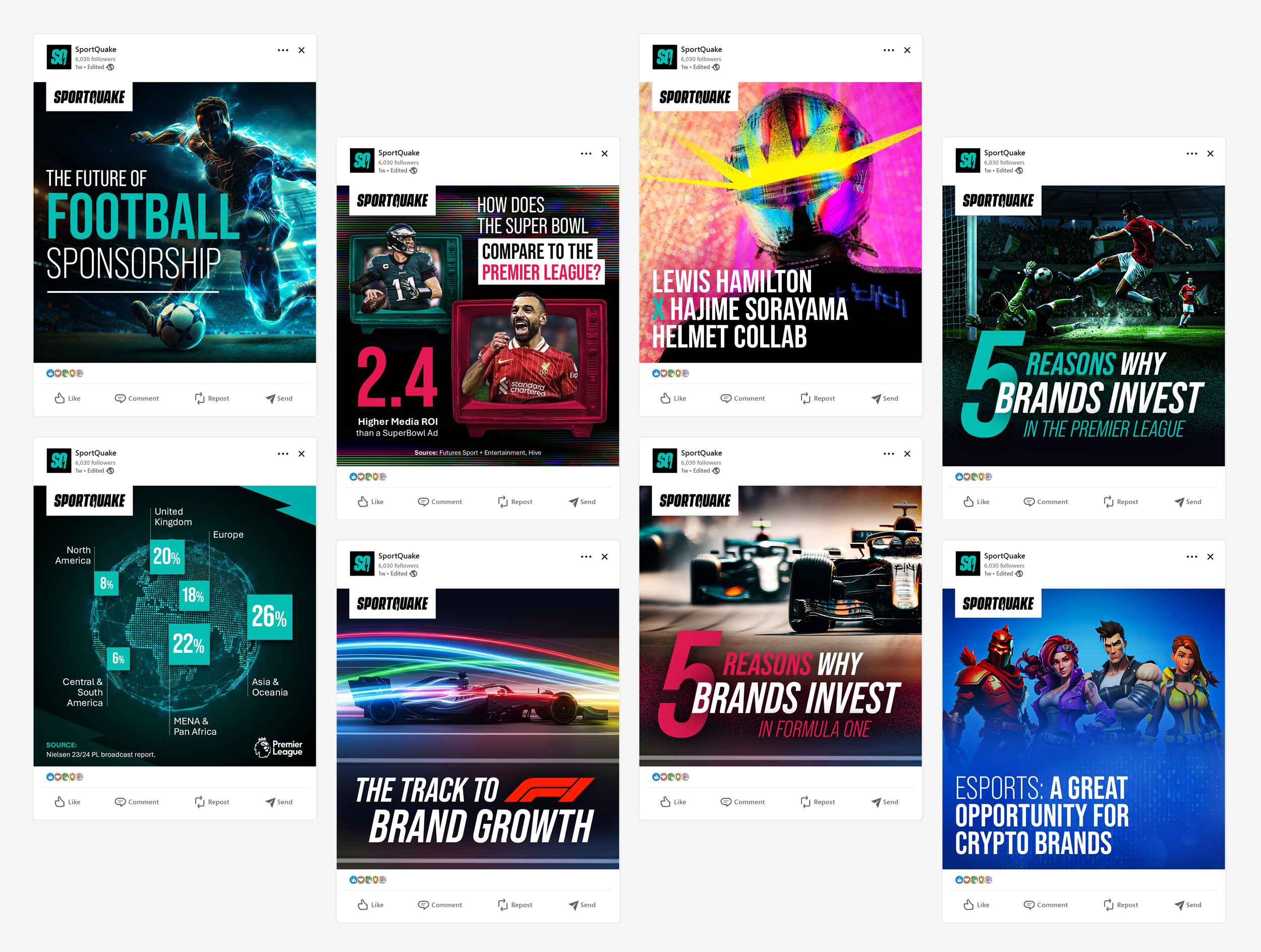
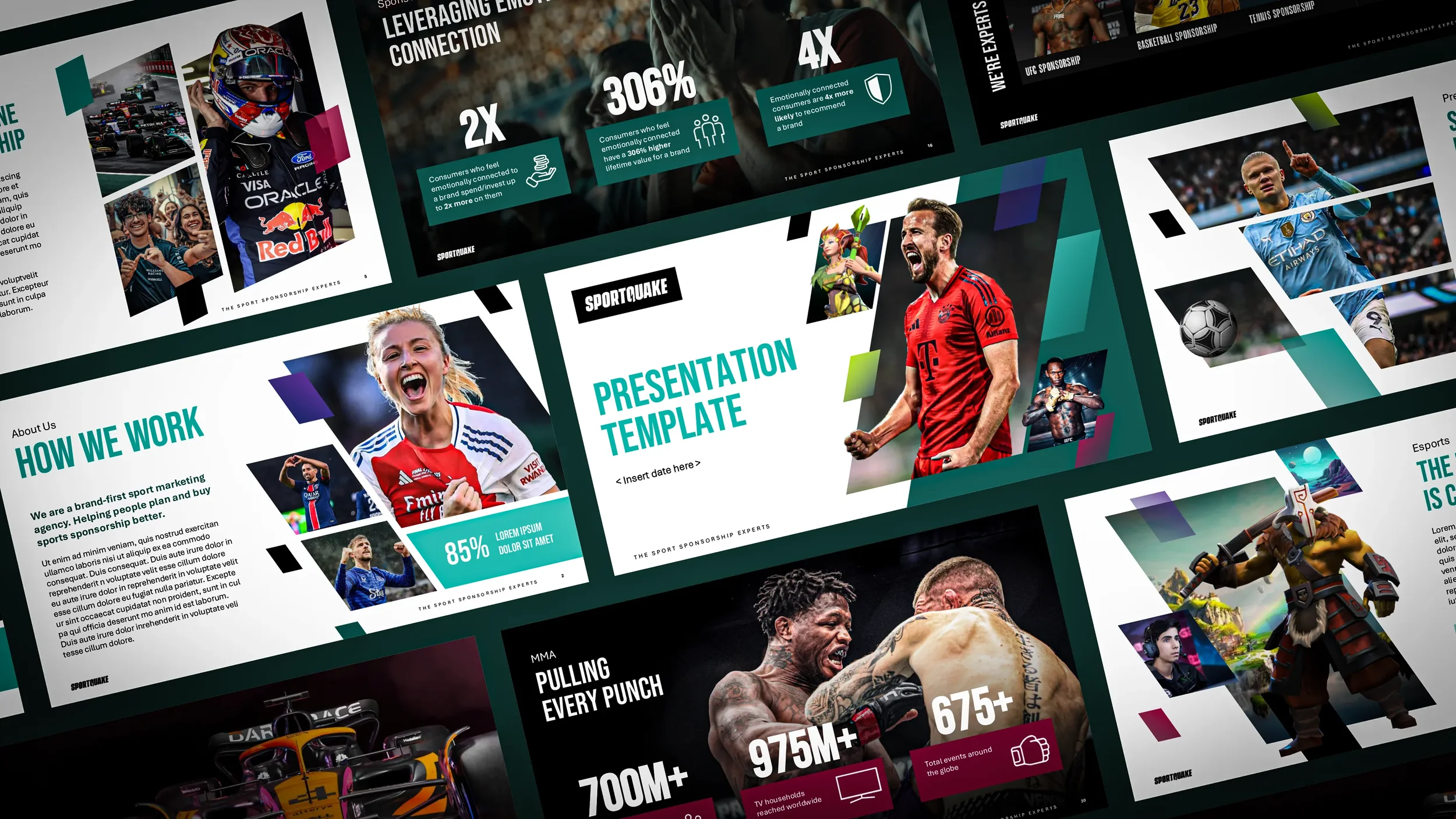
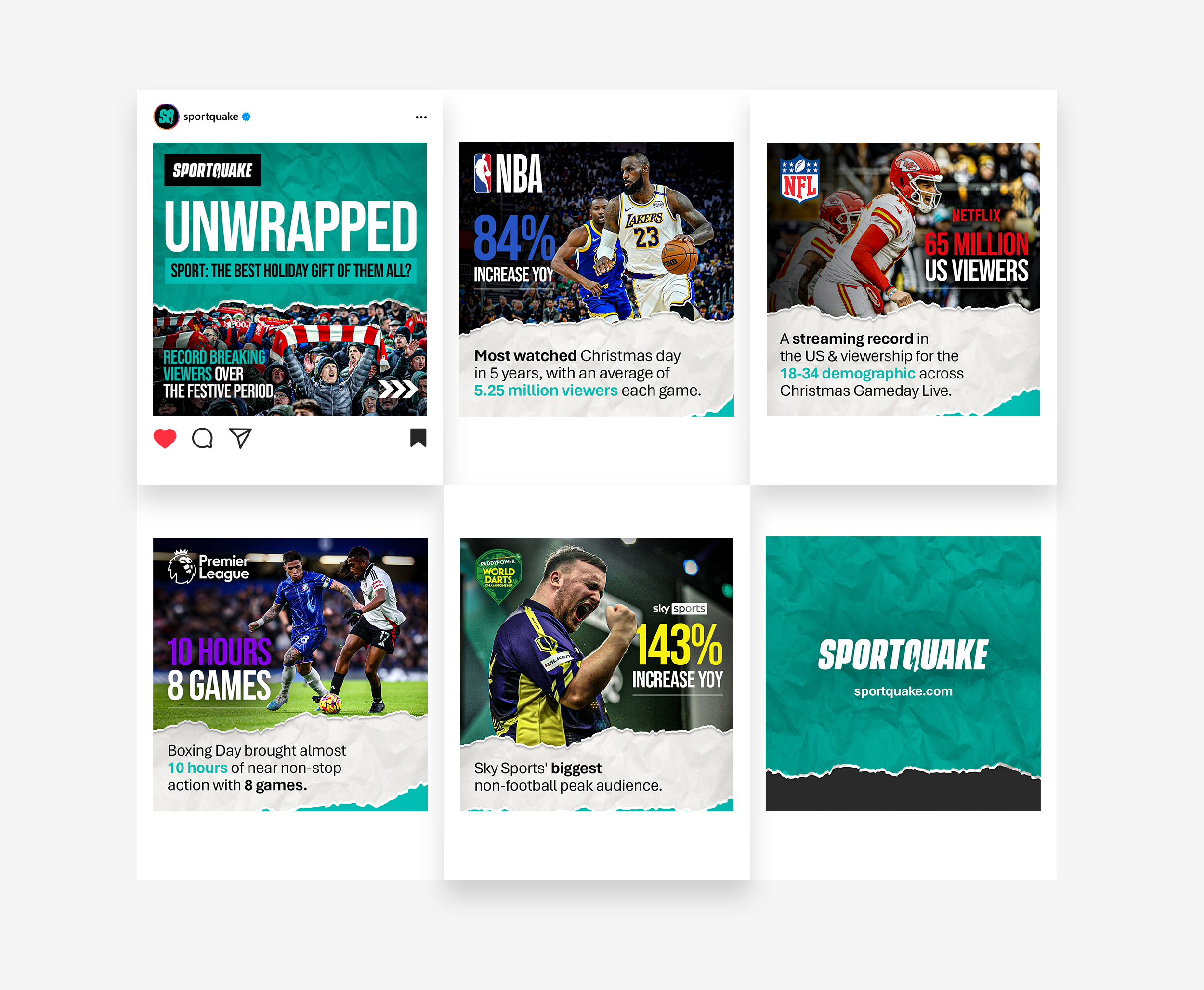
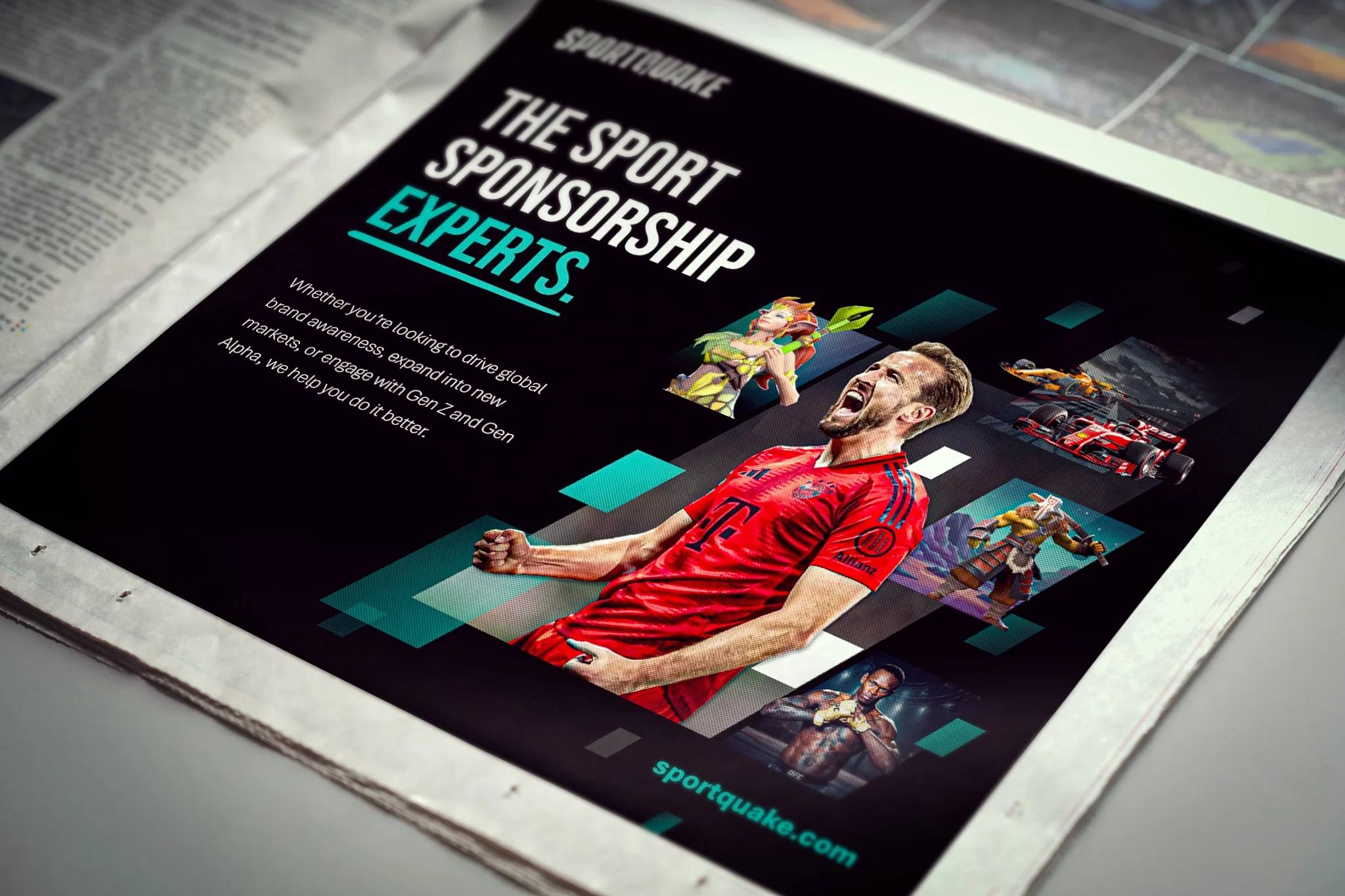
This involved refining and elevating the brand identity, evolving the logo, introducing a cohesive colour palette and sharpening the typography. The result is a more distinctive, contemporary visual language. A flexible system of photography and graphic elements was also developed to bring the brand to life across different contexts, ensuring both consistency and creative versatility.
Alongside the visual work, a strategic messaging matrix was created to define the brand’s tone of voice and key communications. This helps keep storytelling clear and consistent across all digital and print touchpoints.