SPORTAITCHQ
COMPANY REBRAND
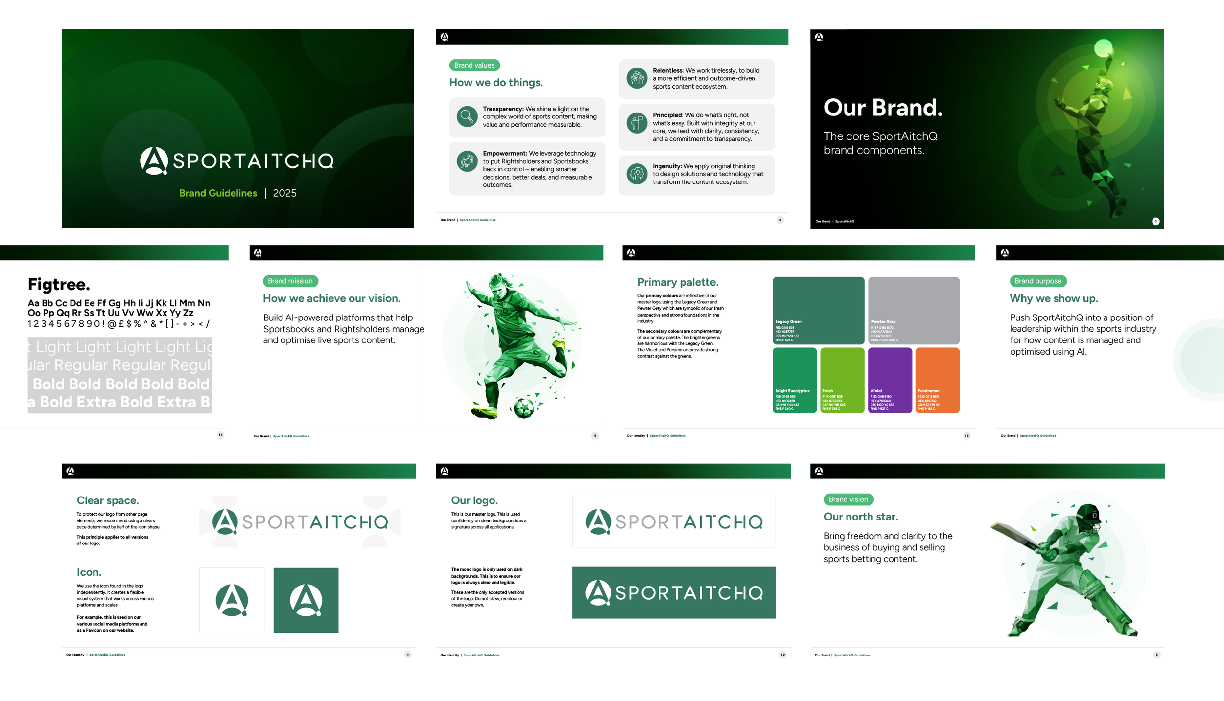
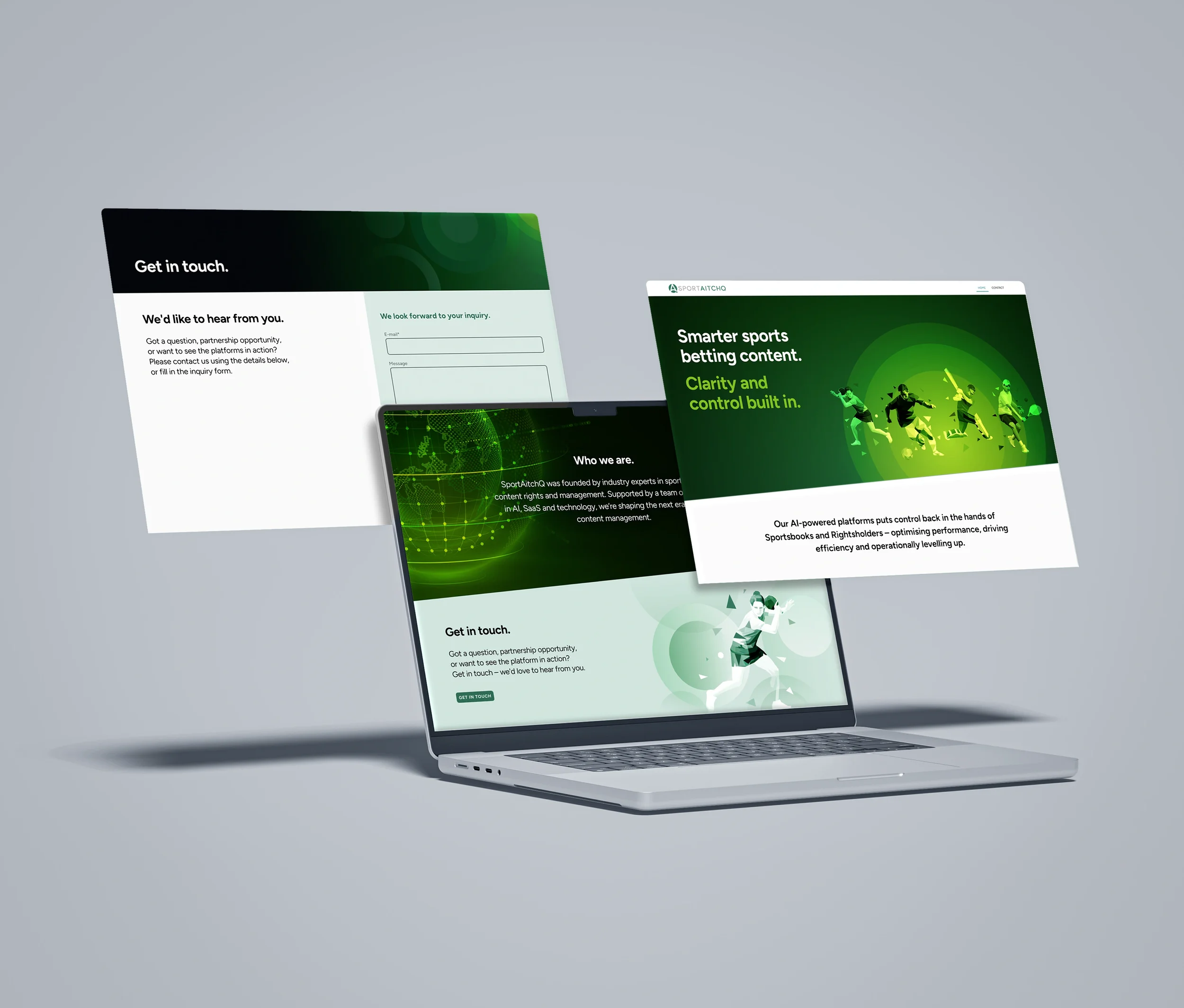
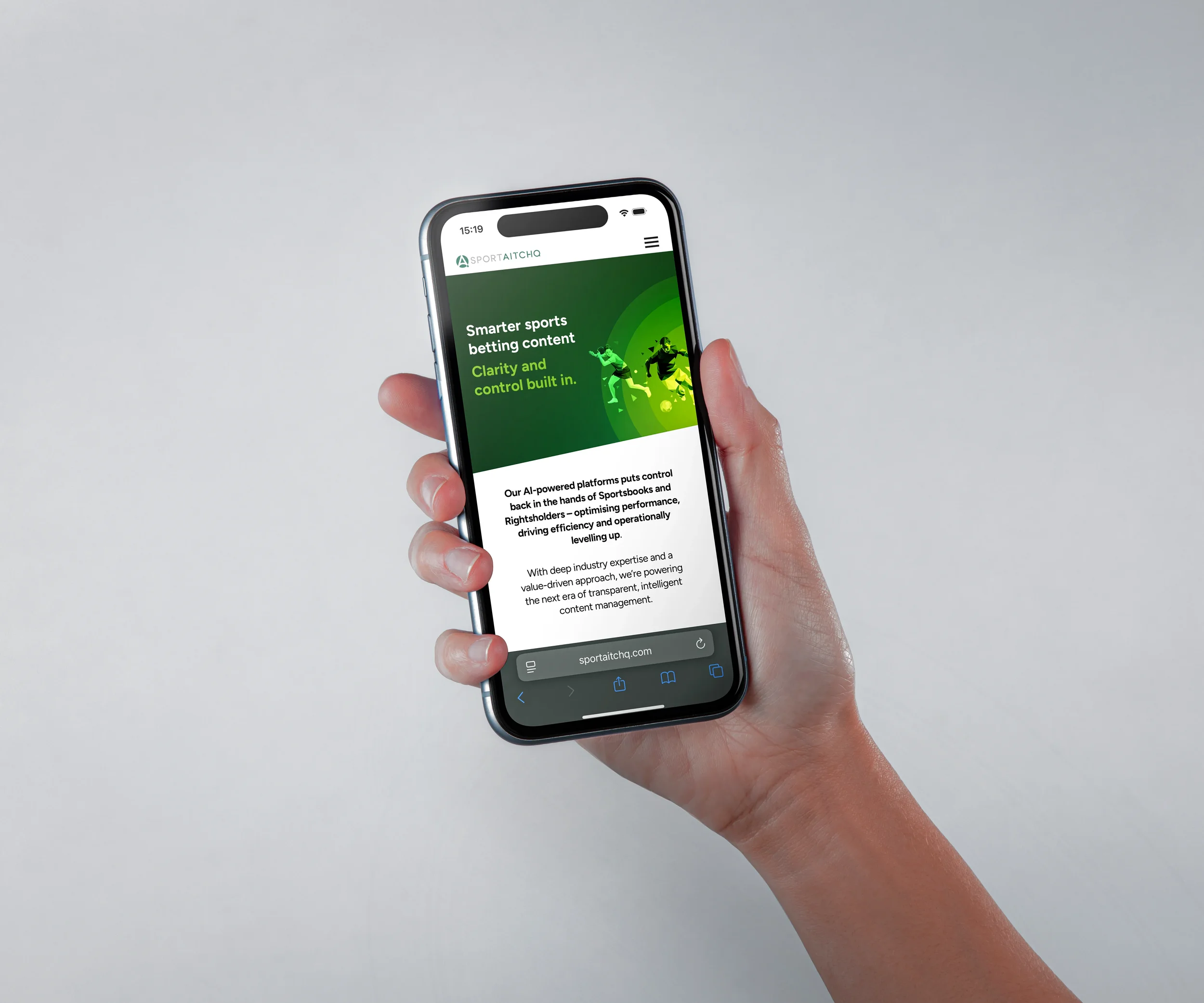
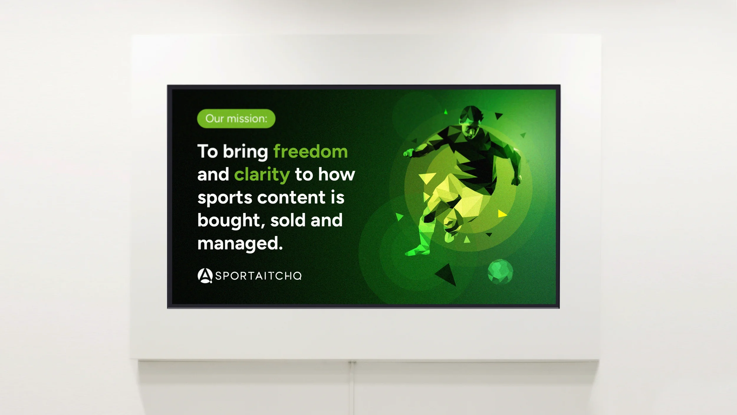
SportAitchQ required a modern visual identity that reflected both their deep industry expertise and the emerging era of sports betting content distribution. Building AI-powered platforms that enable Sportsbooks and Rightsholders to manage and optimise live sports content.

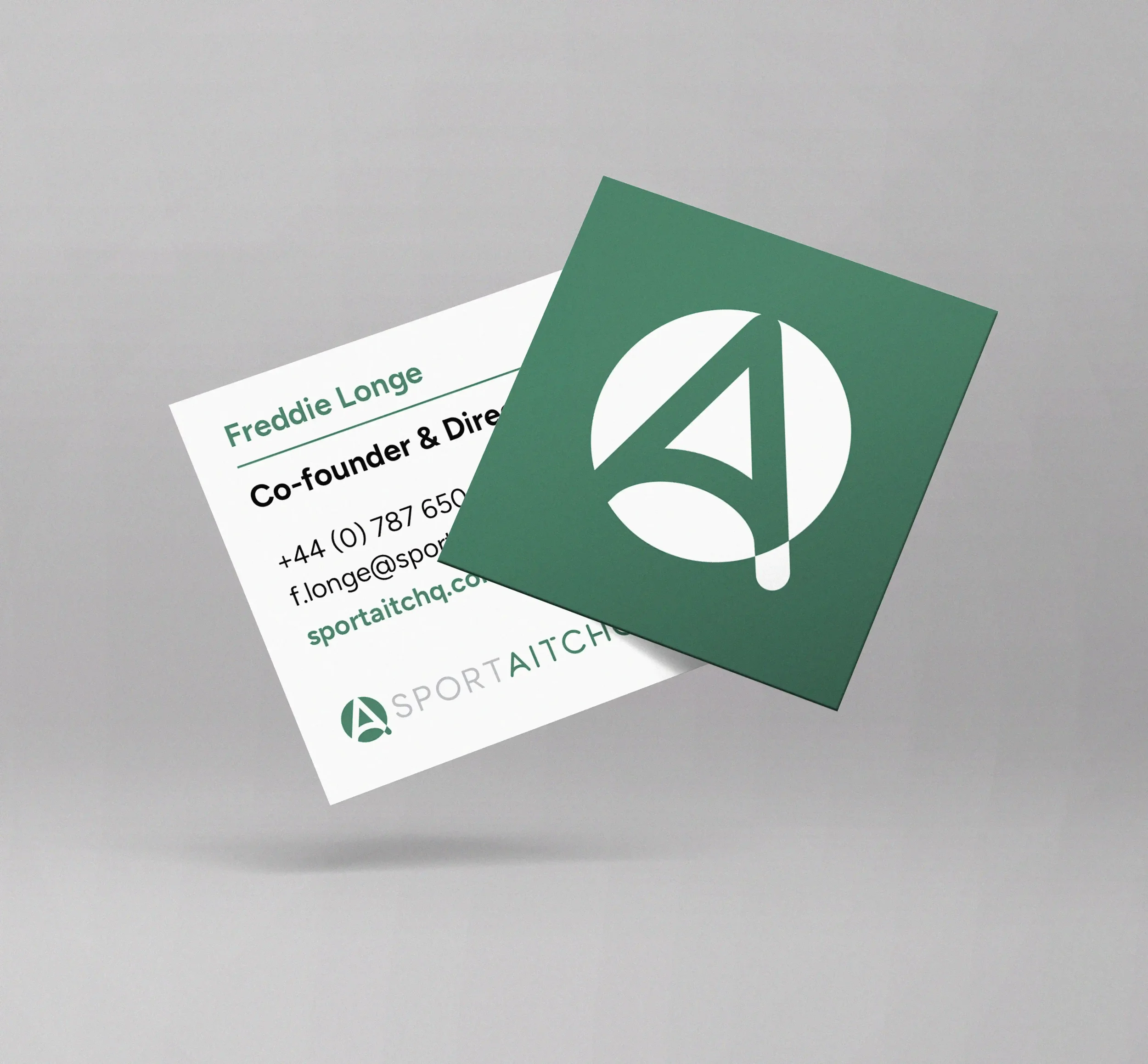
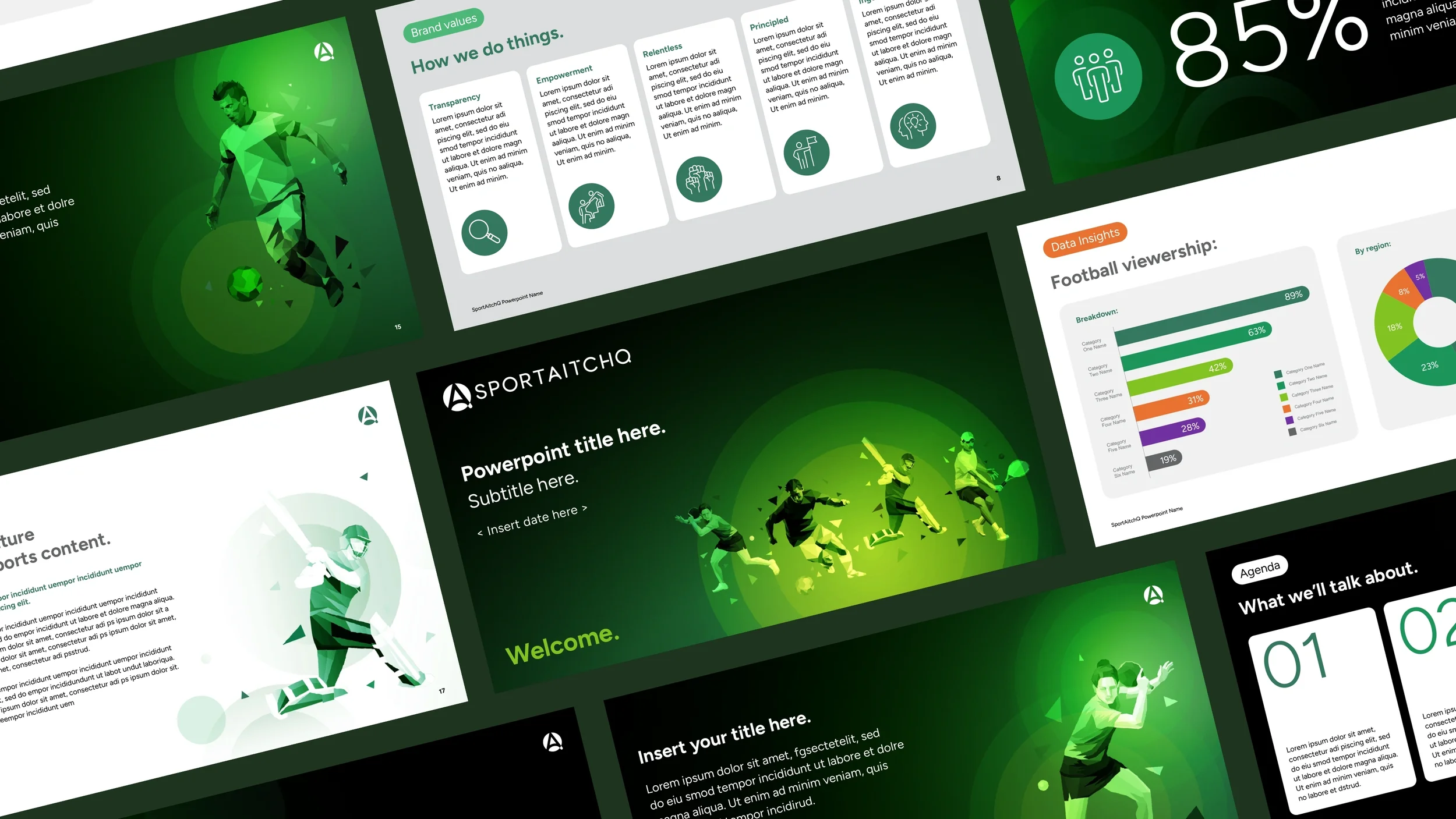
The identity is clean and simple in form, featuring a bespoke typeface that captures the essence of Botsonality. It feels powerful, distinctive, and perfectly aligned with the SportAitchQ team.
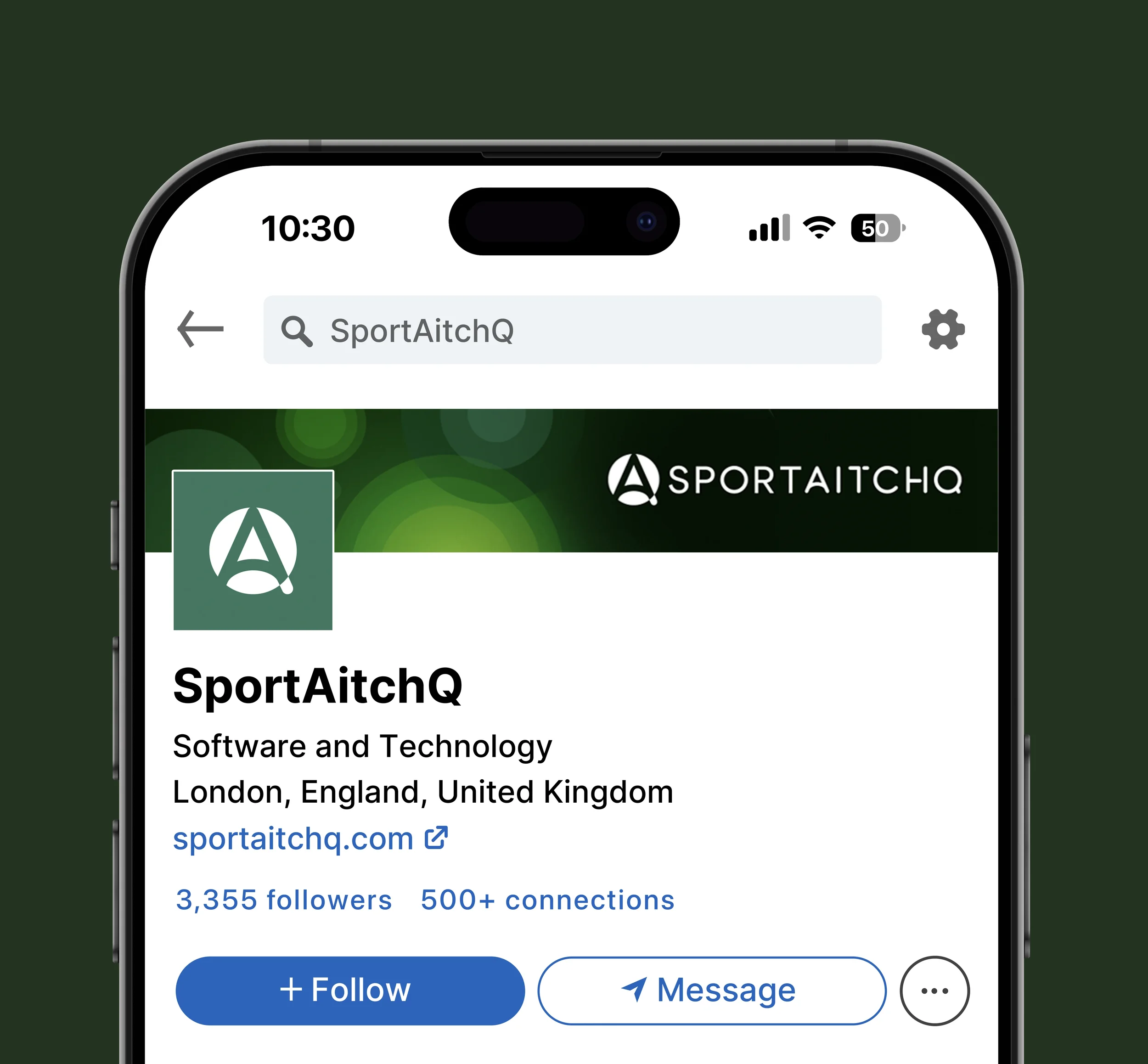
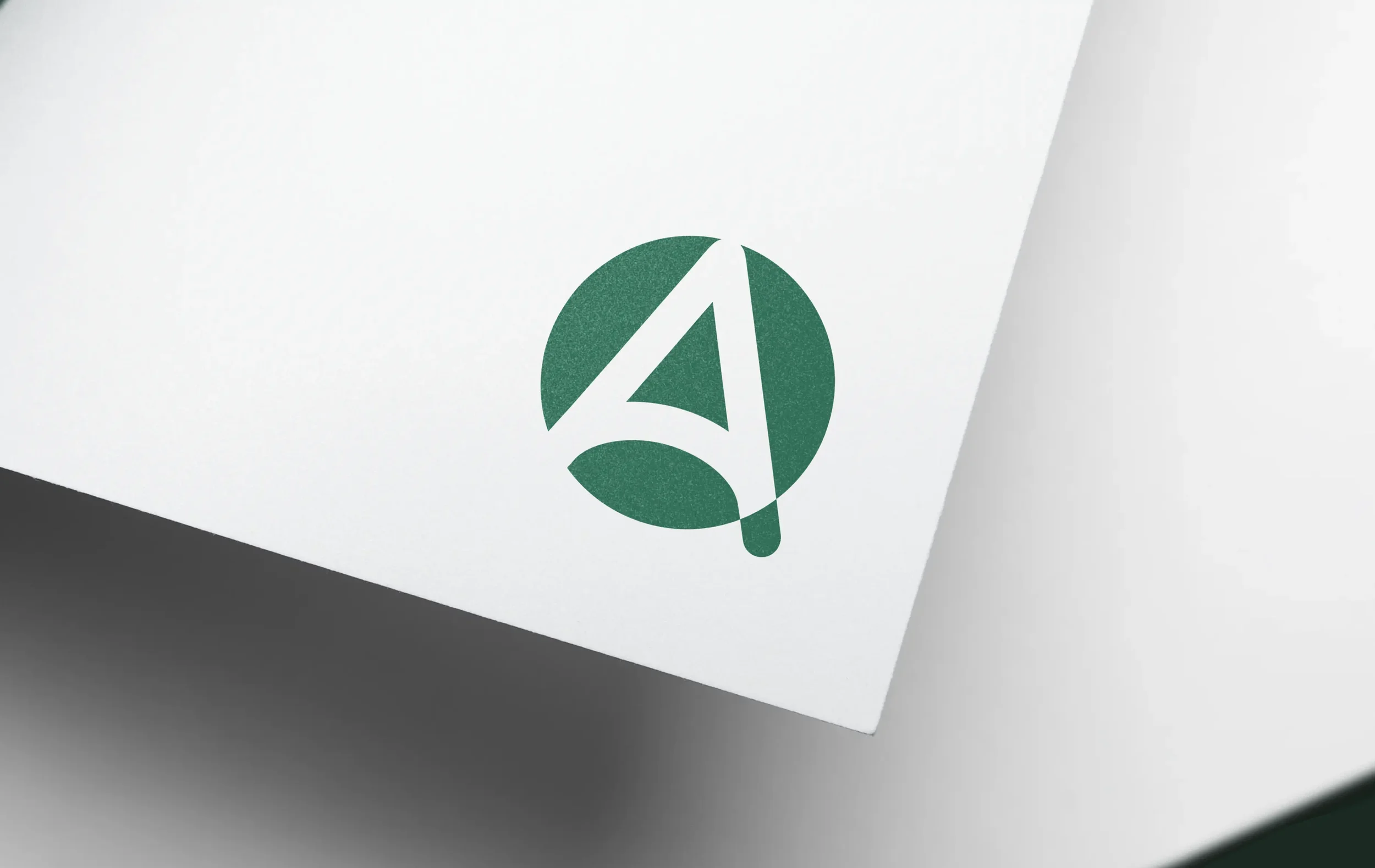
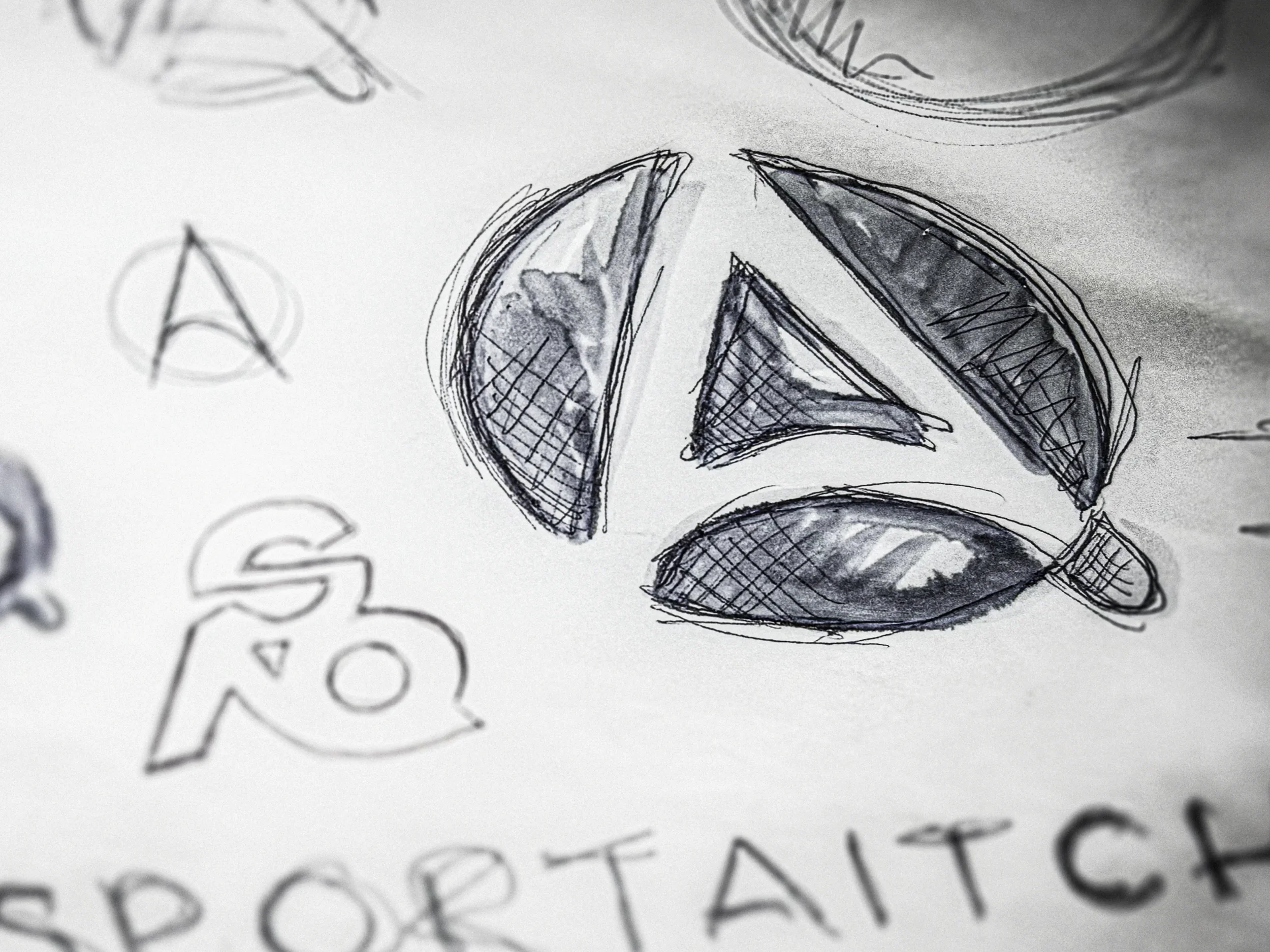
The mark is versatile and forms the AQ icon. This icon has become almost a modern-day totem similar to other sport-related iconography. This works perfectly on various product dashboards and their website favicon. The visual language features simplified polygonal illustrations representing various sports and leagues, visually conveying the brand’s focus on the ever changing shape of sports content.
The brand palette introduces a new primary colour, Legacy Green, created to embody SportAitchQ’s prestige and forward-thinking approach, symbolising growth and stability. These examples demonstrate how the logo and visual identity are applied across both print and digital touchpoints, reinforcing a consistent and confident brand presence.